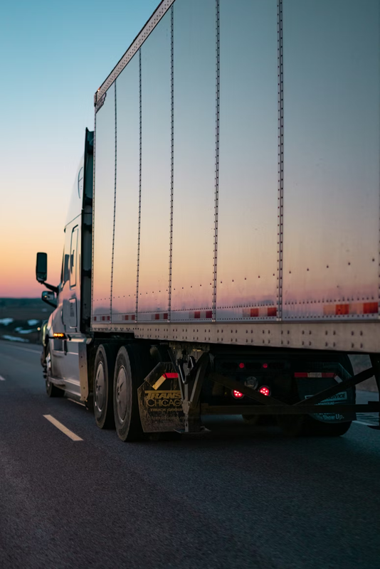
AI powered fleet management platform
The all-in-one platform that gives fleet owners seamless control to simplify operations, unlock new revenue streams, and optimise utilisation.

Trusted by businesses


Why fleets use traknova
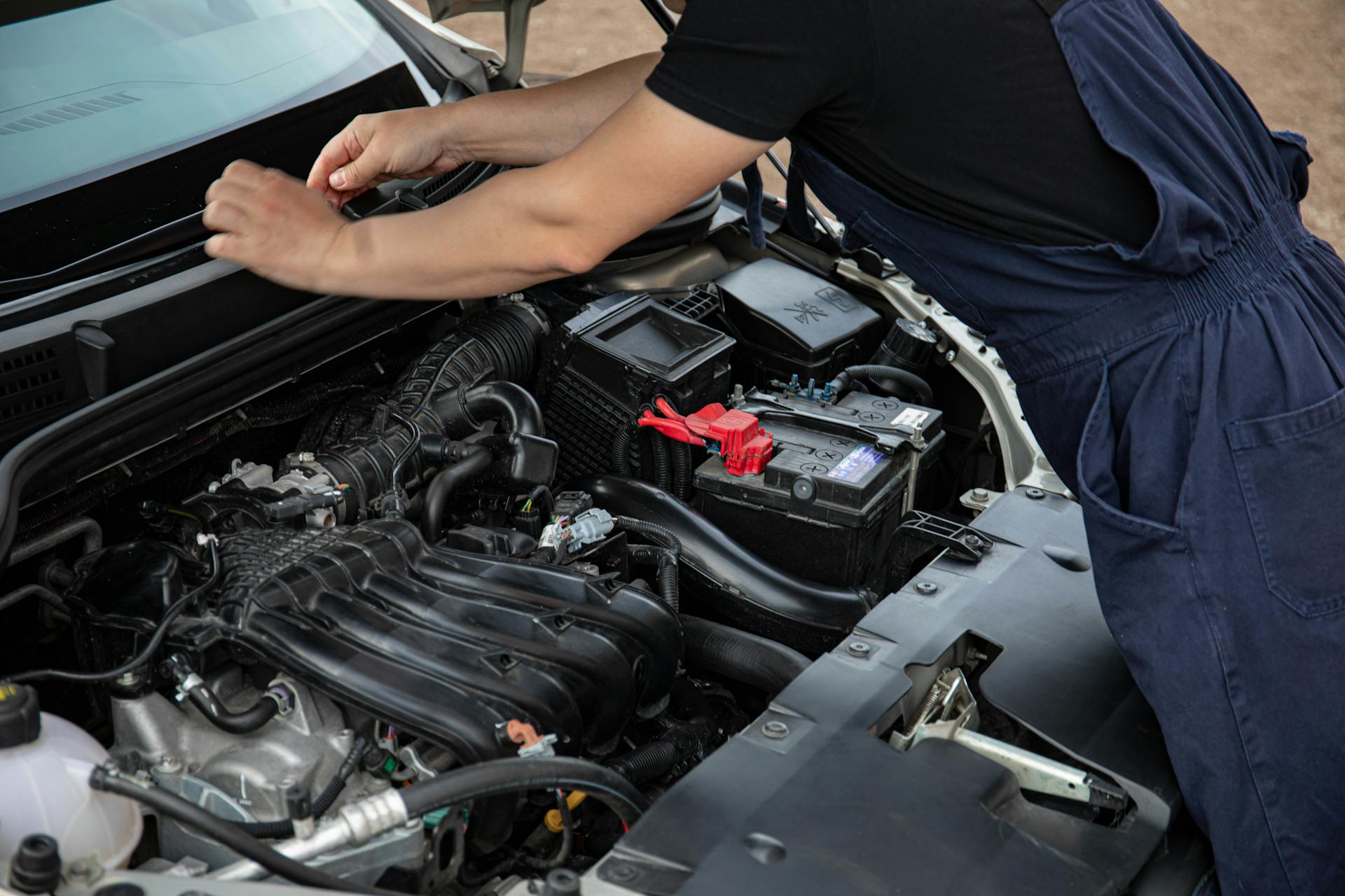
Reduced Theft Incidents
Full integration of our anti-theft suite in 10 days or less. We provide all the training materials needed for a friction-less integration.
Lower Insurance Risk
Reduce your fleet’s risk profile by deploying engine immobilisers and dash cameras that provide the verifiable security data insurers reward.
Fewer tools, fewer logins, lower cost
Replace your fragmented tech stack with a single, integrated solution that handles everything from tracking to maintenance in one dashboard.
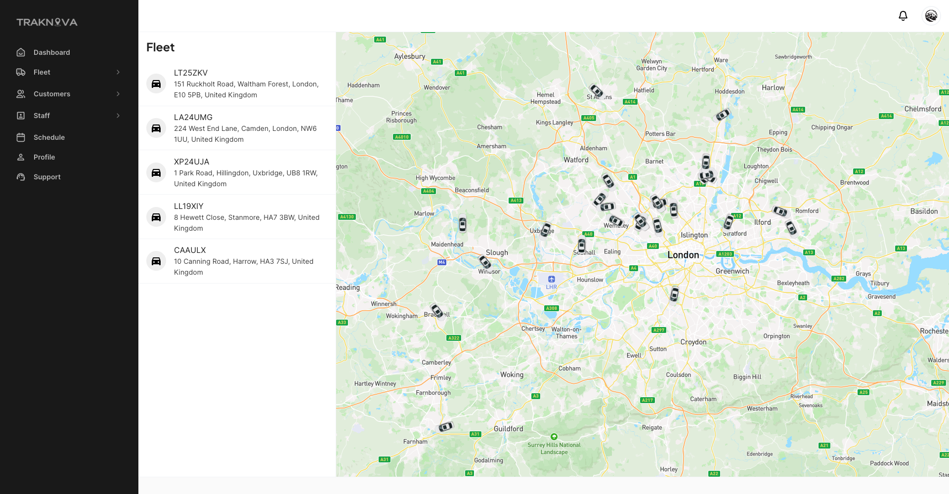
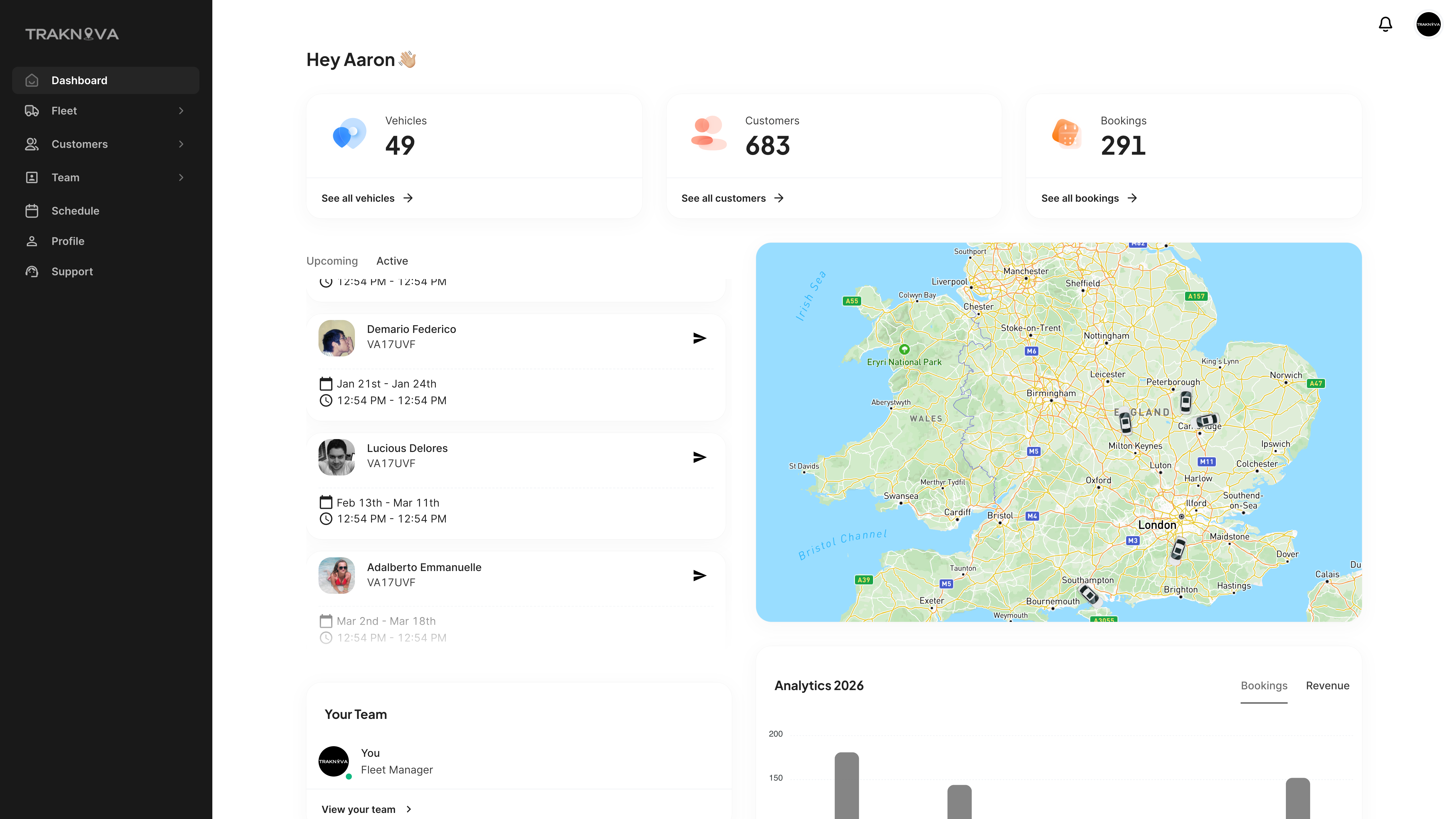
Total Fleet Oversight
Eliminate blind spots with a 360-degree view of your operations, giving you the confidence to act instantly.
Everything you need in one platform
From telematics to security automation, Traknova centralises your vehicle data and fleet tracking into one seamless, powerful platform
Get Demo"Every tool in Traknova hits a real pain point, from wasted hours on key handovers to the constant stress over vehicle security.
It's turned our fleet from a source of anxiety into a streamlined, secure operation"
It's turned our fleet from a source of anxiety into a streamlined, secure operation"
Kash
CEO - Reemas Rides
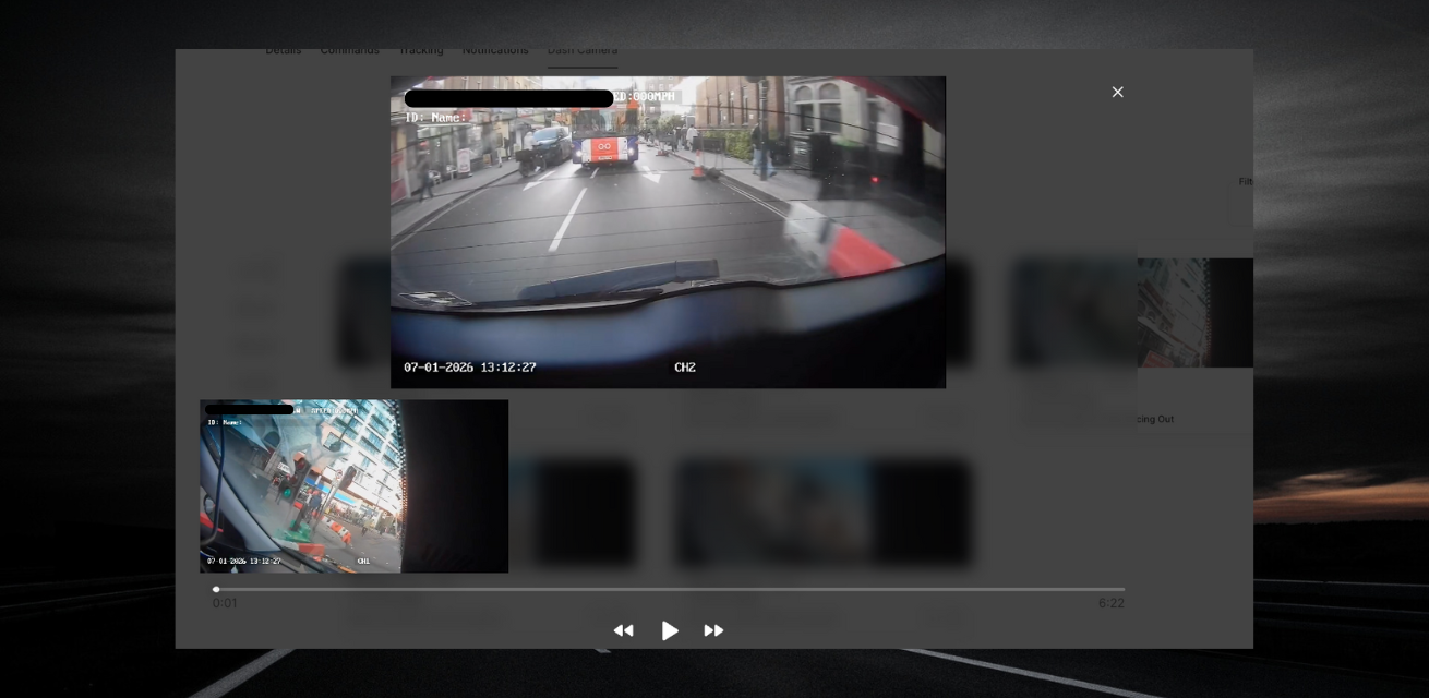
Online cameras & video
Review and handle incidents through a streamlined video dashboard. Protect your drivers, handle legal disputes and reduce theft opportunites. You can tailor every notification to fit your operational workflow.
Online cameras
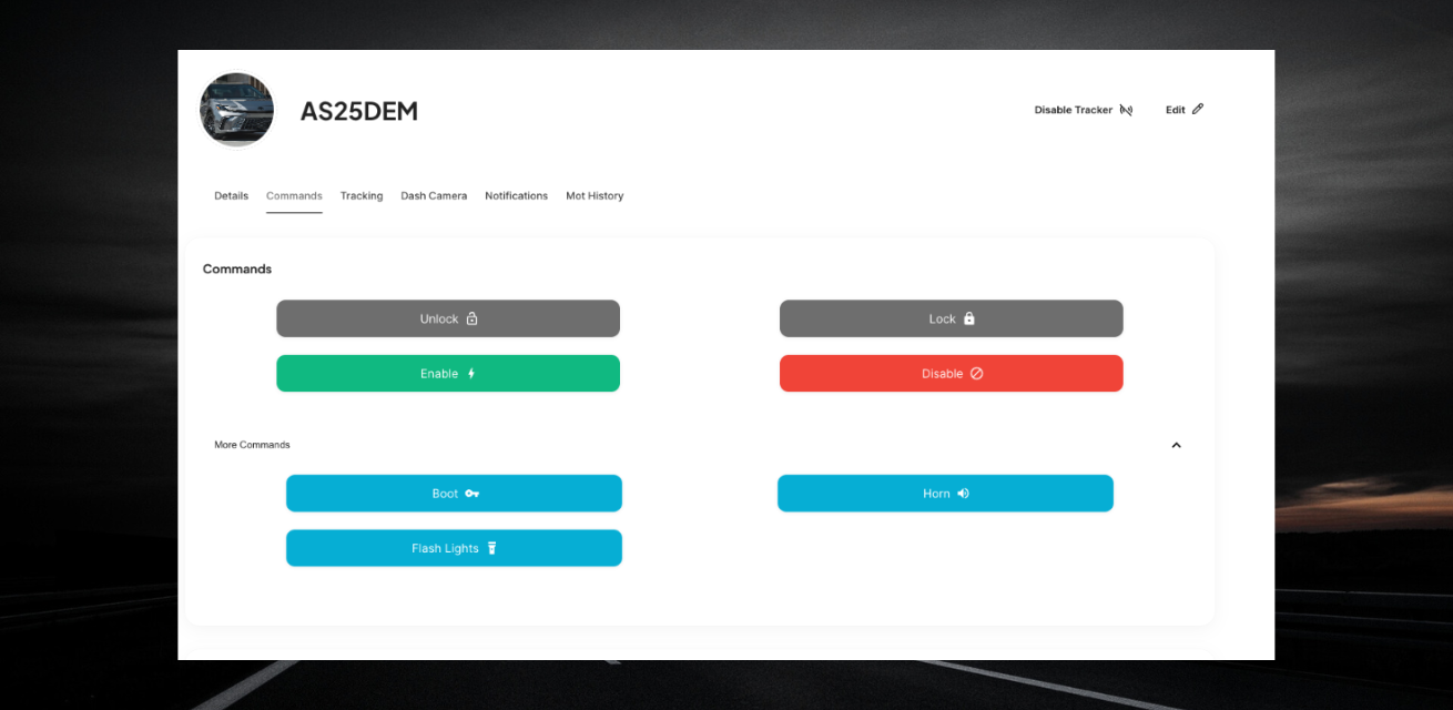
Remote fleet control
Save time and eliminate manual handovers with remote access that handles vehicle locking and engine immobilisation.
Remote access
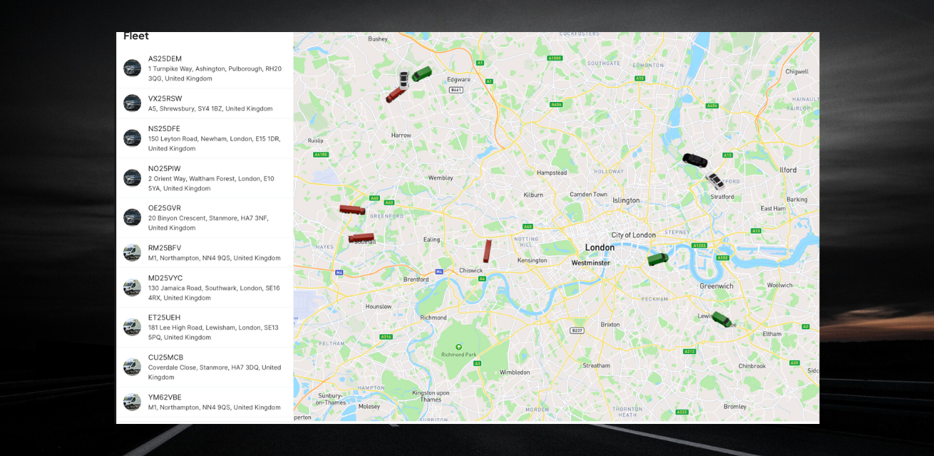
Telematics & tracking
Stay in control with real-time access to all your vehicle information, location, status, and history, all in one place.
Tracking
Complete visibility
Our platform is built for teams that demand 24/7
visibility. We've stripped away
the complexity of old-school telematics to give you
everything from vehicle diagnostics to workforce
management in a single click.
visibility. We've stripped away
the complexity of old-school telematics to give you
everything from vehicle diagnostics to workforce
management in a single click.
Made for growing and enterprise fleets
Real-time dashboards built for fleet managers
АРІ access for easy integration
Made for fleets in every industry
.png)


Taxi & Private Hire
Supporting fleet owners and operators in
monitoring driver safety and asset protection
monitoring driver safety and asset protection
Learn More

Car sharing
Automate your rental or sharing workflow with
secure keyless access and real-time security
tracking designed for a high-turnover fleet.
secure keyless access and real-time security
tracking designed for a high-turnover fleet.
Learn More
Logistics & Delivery
Optimize route efficiency, track time-sensitive
shipments, and manage driver performance with real-time data designed for high-speed delivery networks
shipments, and manage driver performance with real-time data designed for high-speed delivery networks
Learn More
Clear answers. Nо hidden clauses.
From setup to support and pricing, here are quick
answers to the most common questions we get
from fleets considering Traknova
answers to the most common questions we get
from fleets considering Traknova
Watch Demo
How long does setup take?
Most fleets are fully onboarded within 10 days.
We provide all the training material and installation diagrams needed.
Does this work with my current software?
Yes, We designed Traknova for flexibility. Whether you need a direct API connection to sync data with your internal systems or a fully branded experience for your own clients.
What kind of support can I expect?
We don't leave you in the dark. All our users get full live chat and phone support as standard.
Where can I track my fleet?
Everywhere. Our software provides seamless coverage in over 150 countries, ensuring your vehicles stay connected and visible.